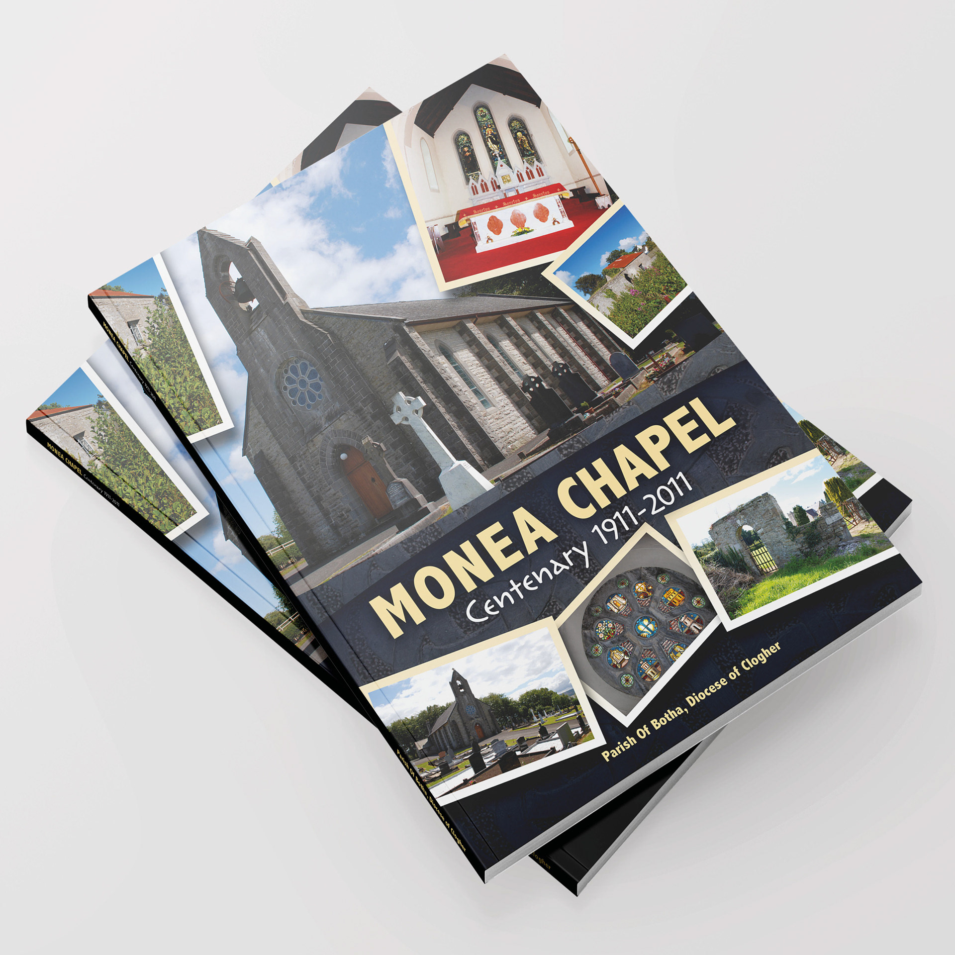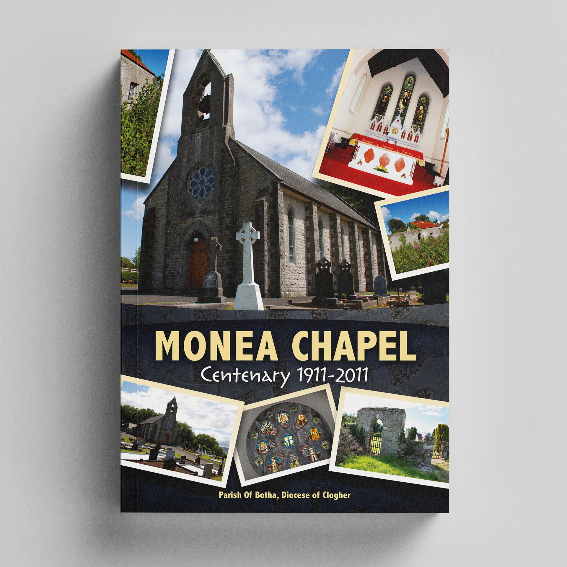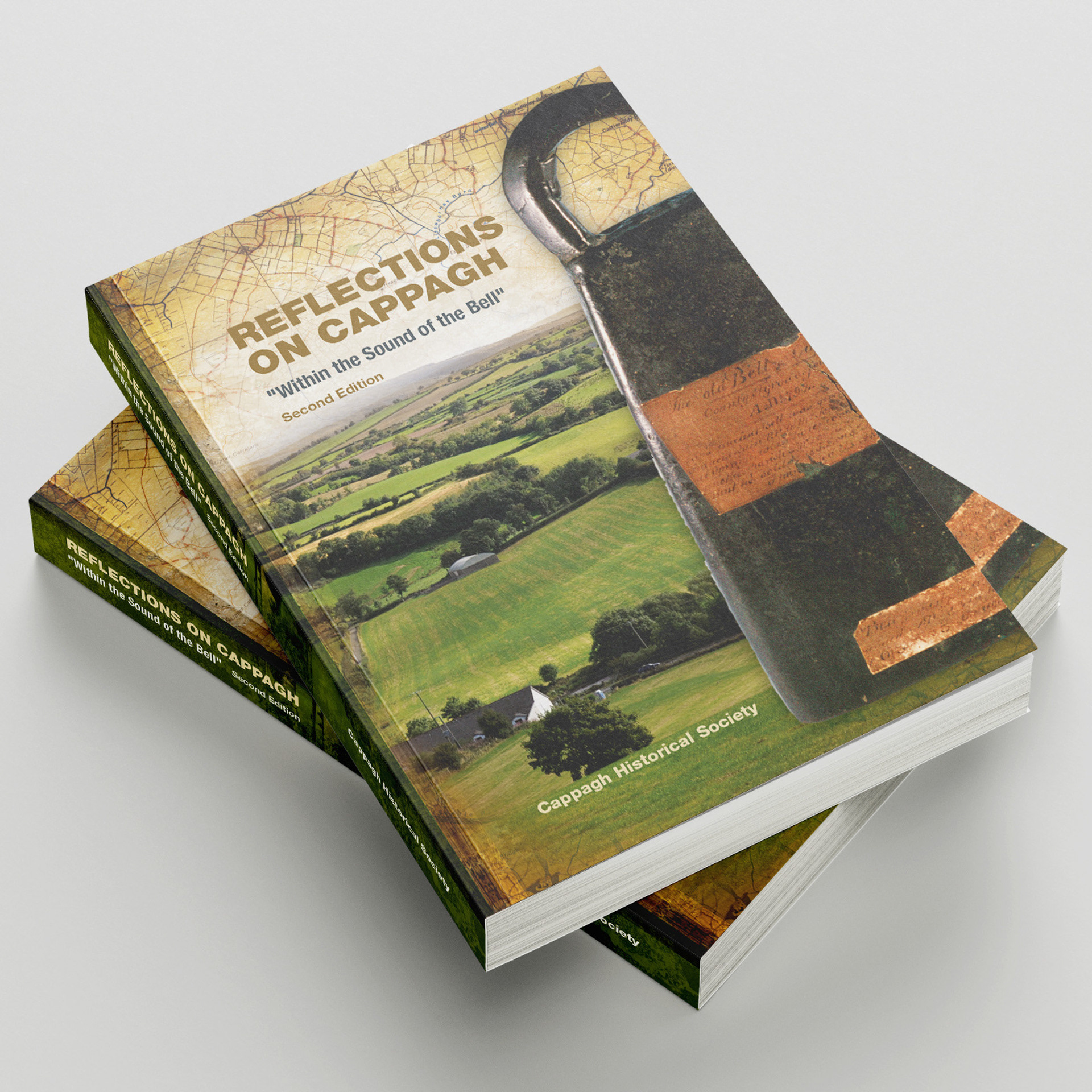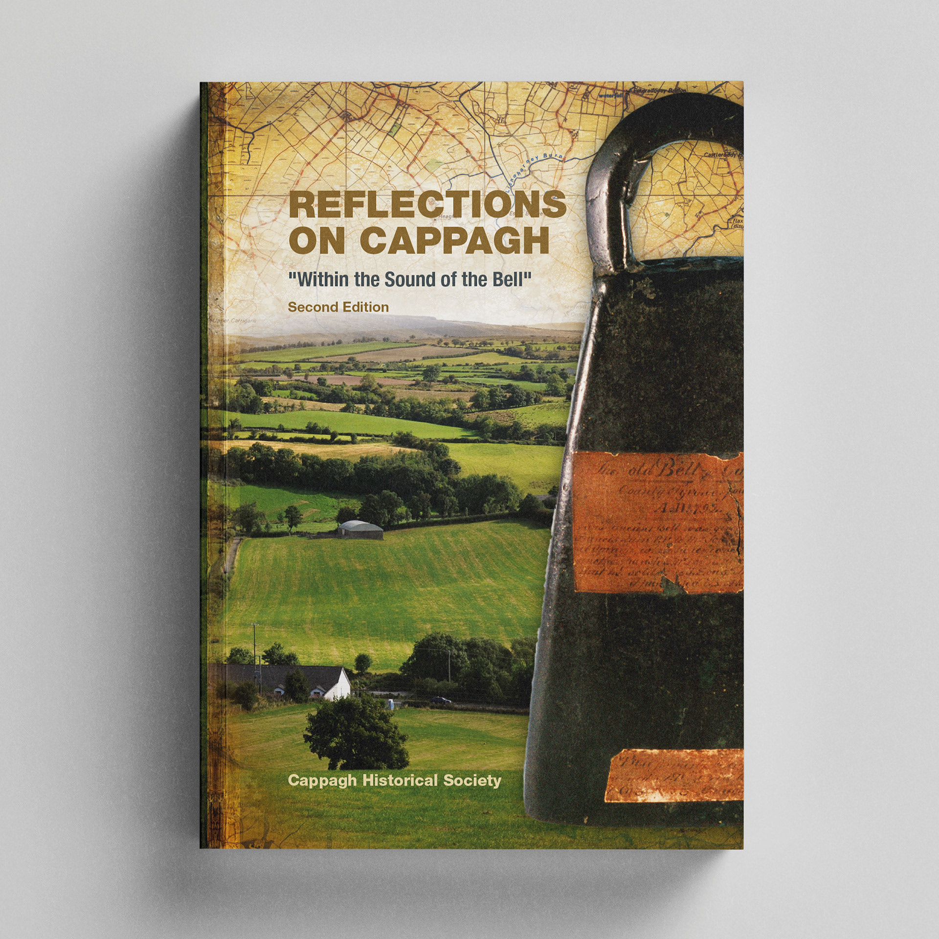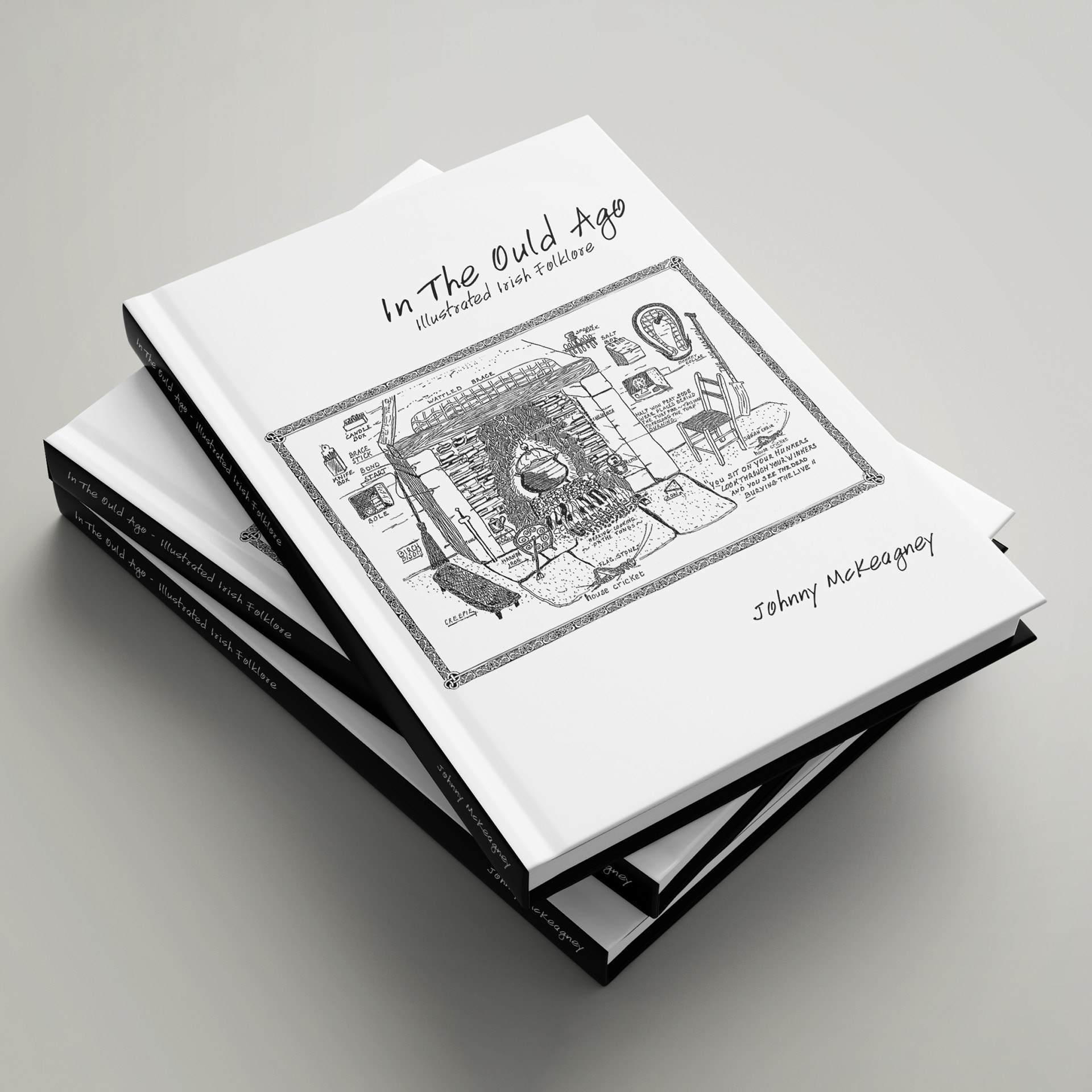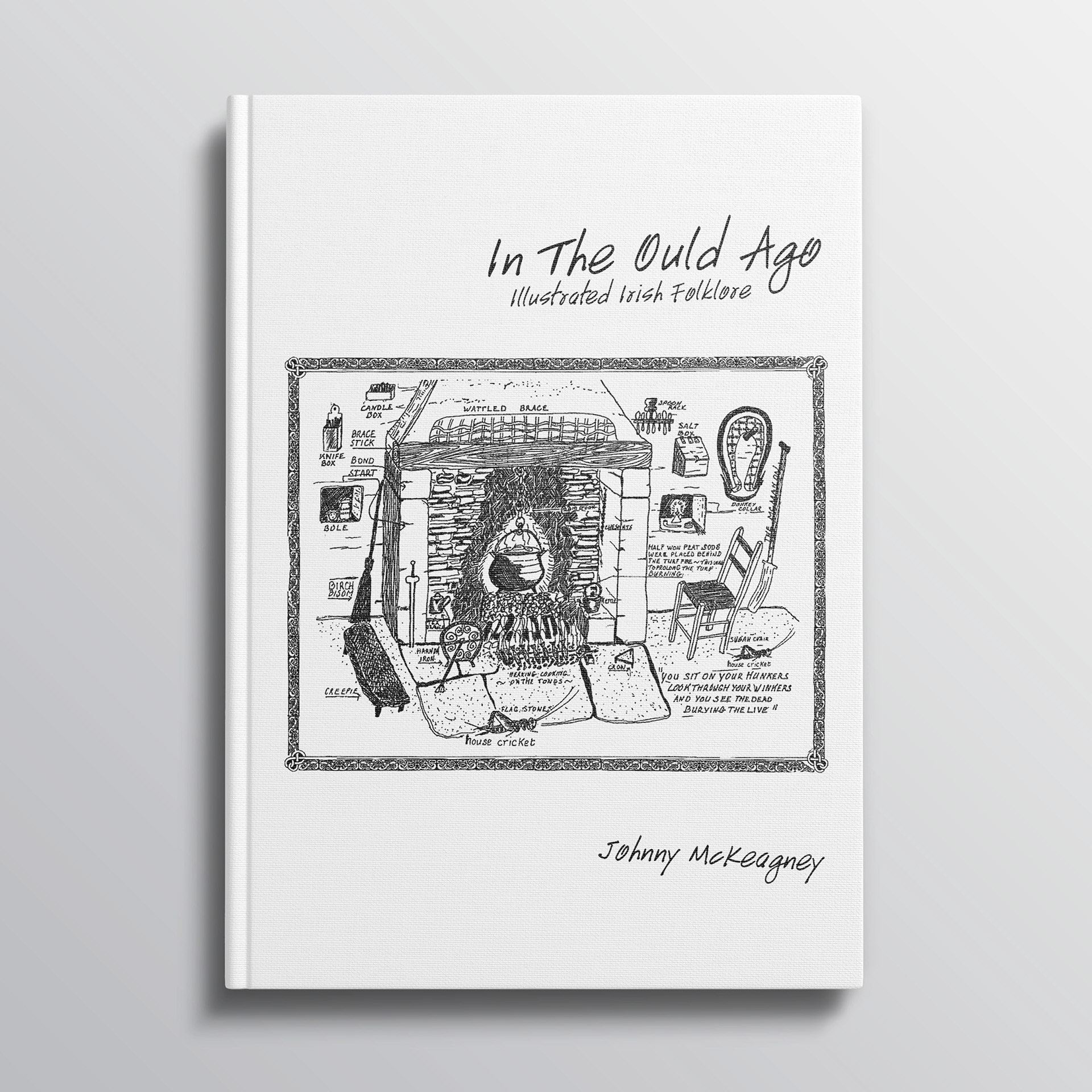
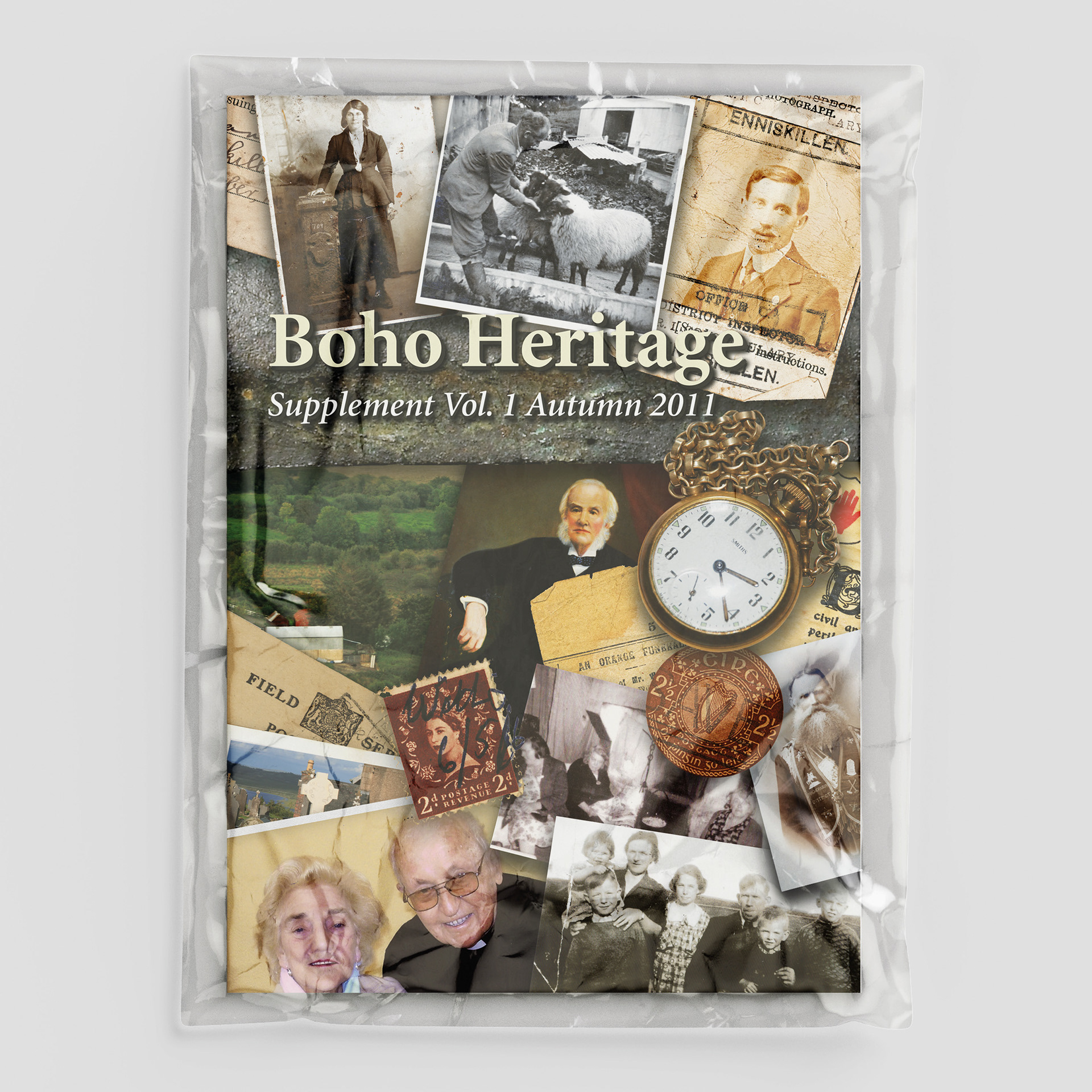
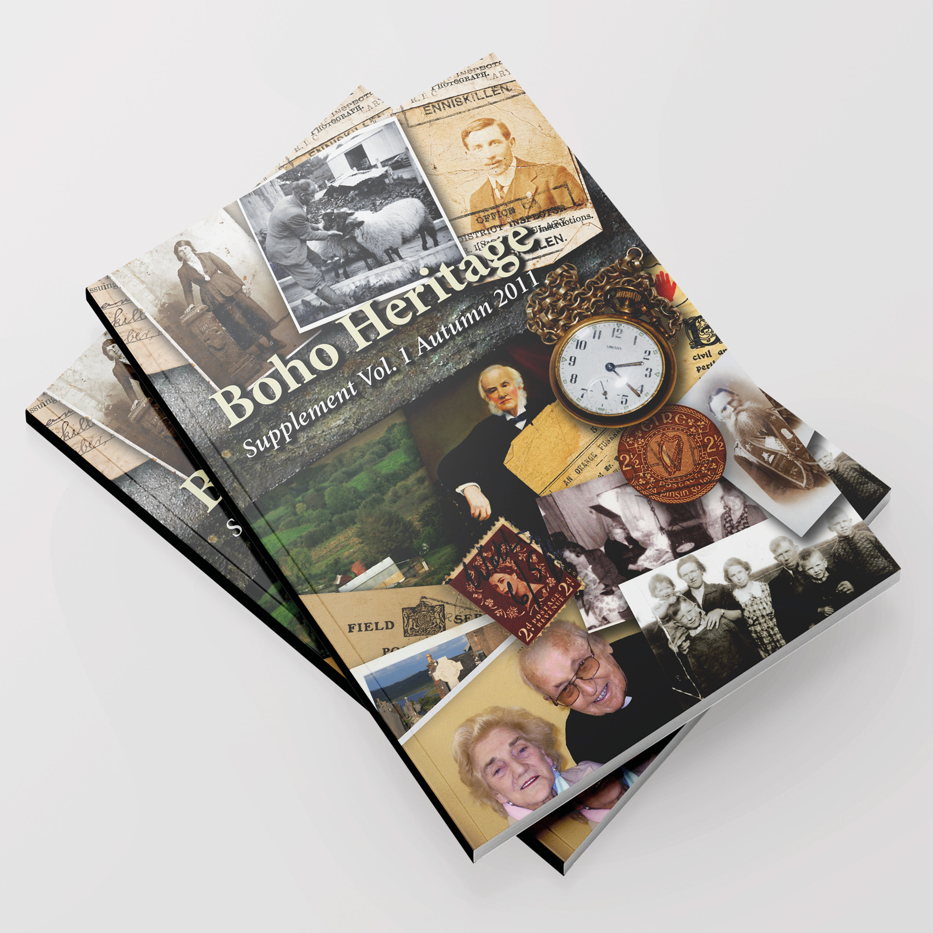
Boho Heritage Supplement Vol. 1
Working on Boho Heritage: Supplement Vol. 1 (2011) and Supplement Vol. 2 (2016) has been one of the most meaningful and creatively fulfilling chapters of my design career. These publications are far more than community magazines; they are living archives of memory, landscape, and identity. My role as graphic designer placed me at the intersection of storytelling and preservation, where every page became an opportunity to honour the people of Boho and the generations who shaped its history.
My background has always drawn me toward projects rooted in place and memory. I’m naturally meticulous, the kind of designer who obsesses over typography, spacing, and the quiet emotional weight of an old photograph. But I’m also deeply aware of the responsibility that comes with handling historical material. Many of the images, letters, and personal accounts entrusted to the Boho Heritage Organisation were fragile, unique, and irreplaceable. My task was not simply to arrange them on a page, but to present them with dignity, clarity, and a sense of continuity with the past.
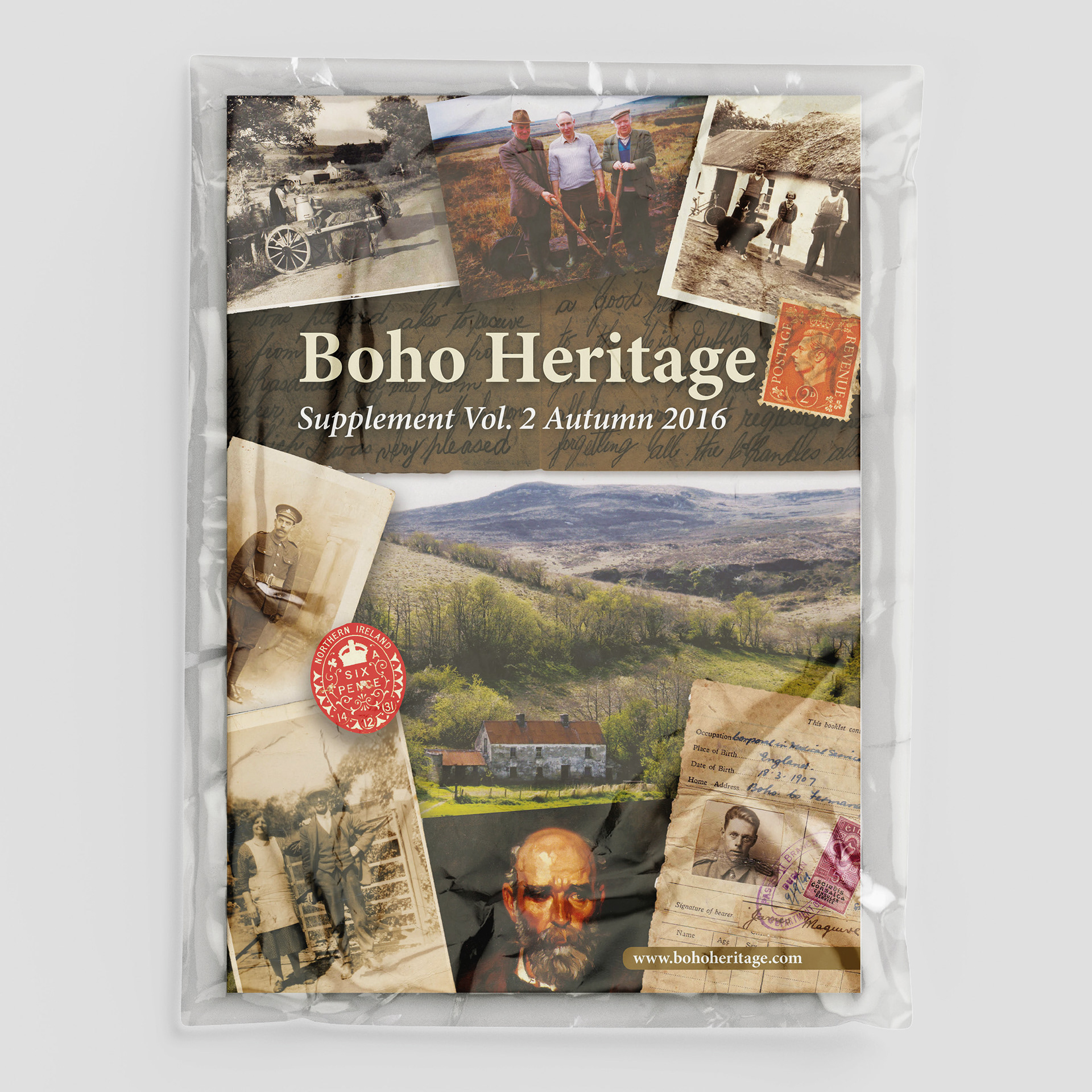
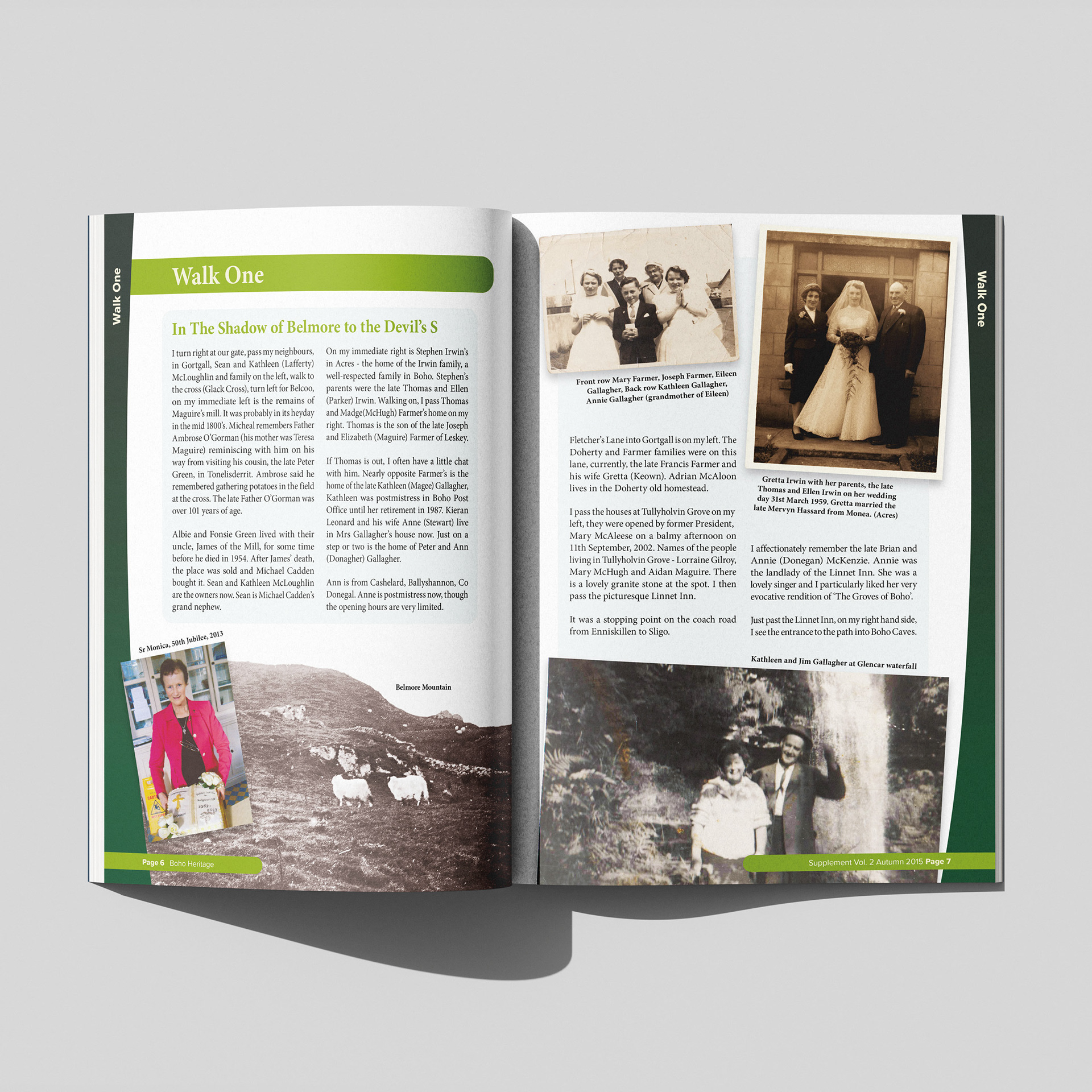
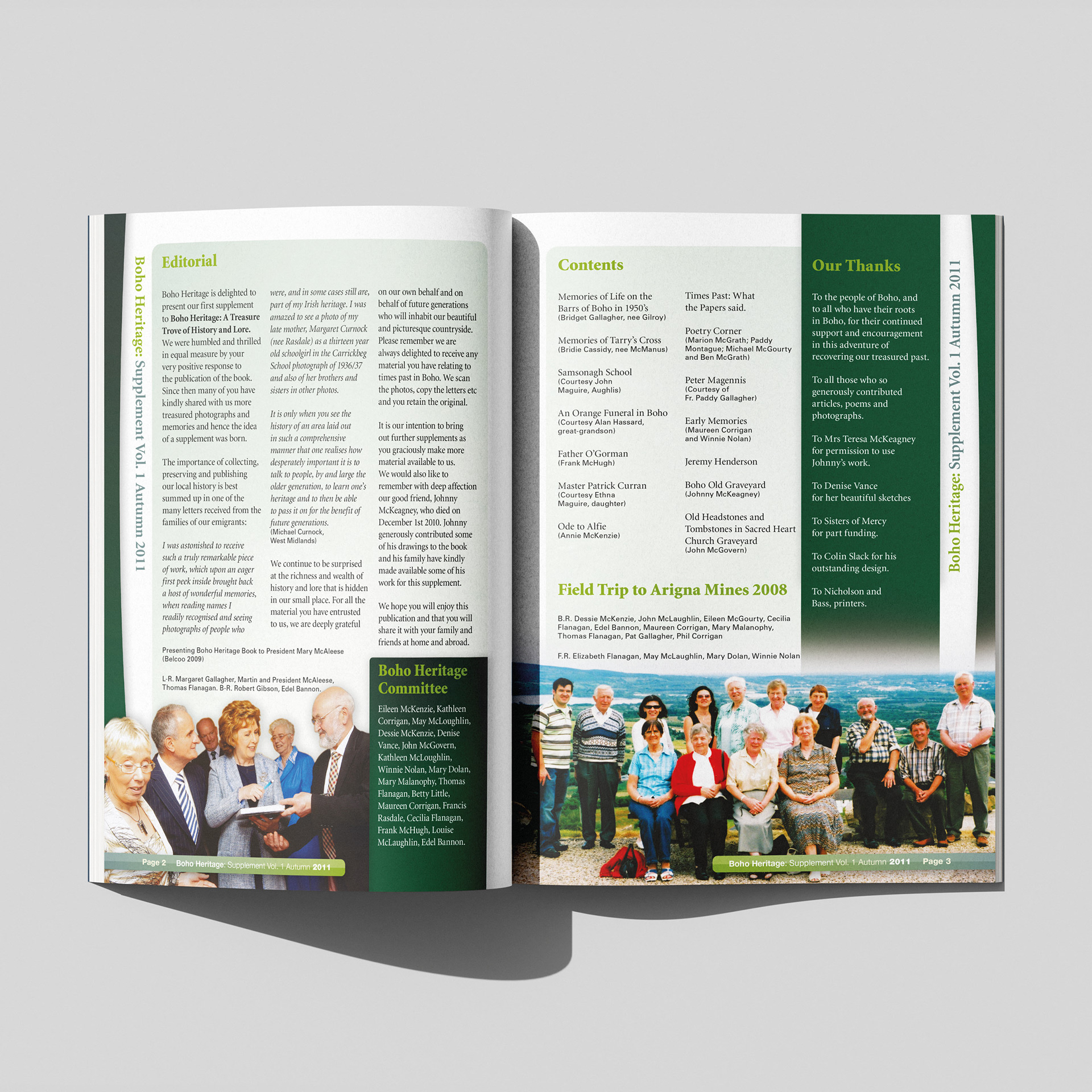
For Supplement Vol. 1, I worked closely with the committee to shape a visual language that felt warm, respectful, and rooted in the rural character of the area. The stories, from memories of life on the Barrs to accounts of Samsonagh School and the old traditions of the parish, carried a natural rhythm, and my design approach aimed to let those voices lead. Clean layouts, generous white space, and careful restoration of archival photographs helped create a publication that felt both contemporary and timeless.
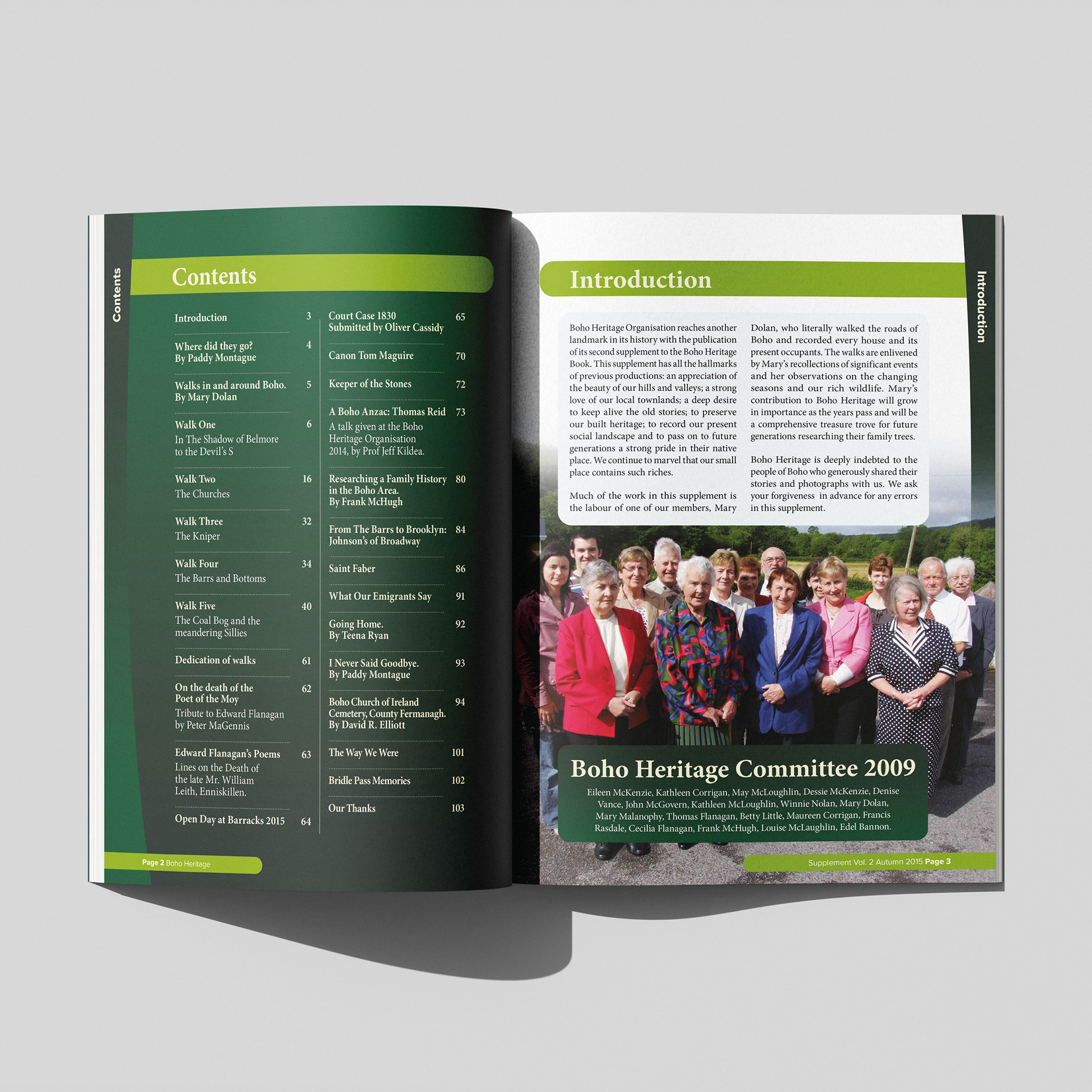
By the time we reached Supplement Vol. 2, the project had grown in ambition. The content expanded into walking guides, genealogical research, poetry, emigrant stories, and detailed historical essays. My role evolved with it. I developed a more structured visual system to support the variety of material, ensuring that maps, photographs, personal recollections, and historical documents could coexist without overwhelming the reader. The challenge, and the joy, was in balancing clarity with atmosphere, allowing the publication to feel like a companion for both locals and those tracing their roots from afar.
Across both supplements, my guiding principle remained the same: to design in a way that respects the community’s voice. These books are built on generosity, people opening their albums, sharing their memories, and trusting that their stories will be handled with care. My contribution was to give those stories a home that felt worthy of them.
Looking back, I’m proud not only of the finished publications but of the collaborative spirit behind them. The Boho Heritage Organisation is driven by passion, curiosity, and a deep love for place. Being part of that effort, helping shape how the community sees itself and how future generations will encounter their past, has been a privilege.
These supplements stand as a testament to Boho’s enduring character, and I’m grateful that my design work could play a part in preserving and presenting that legacy.
Client
Boho Heritage
Project
Magazine Design
Size
210mm x 297mm